Telling a story with complex data: How to present your figures in a compelling way

The dense technical data contained within is often impenetrable to outsiders, an endless ream of figures and statistics that, for any layperson, is difficult to comprehend and make sense of.
For managers, part of the challenge of dealing with data of this kind is presenting it to stakeholders in an informative and compelling way. And as the volume and complexity of data collection and storage increase, the need to create clear and approachable representations of data increases too. You may be able to understand the figures, but delivering them in a way that tells a story will mean others who lack your expertise can make sense of things more readily, helping them to reach decisions and act in the process.
Here, we’ll delve into some strategies you can use to present complicated data as easy-to-follow, engrossing stories that everyone can understand.

Look for the narrative
Presenting data involves giving an account of the facts and finding the connections that link them, without merely recapitulating the information. Enormous breezeblocks of information hurled the audience’s way can be a problem because of their impenetrable density. Look for a narrative in your data that you can use to hook the audience.
The typical narrative arc of books, films and TV shows tends to follow exposition (or setting the scene), “rising action”, which tends to be the bulk of the action, before these events lead to a conclusion. Your data could just as easily follow the same structure, leading to a logical conclusion that the audience has been guided towards over the course of the presentation.
Creating a story with your data in a compelling way is key, and don’t forget about the importance of interaction either. You’ll want people to engage with your findings in a meaningful way.

Consider who your audience is
Before you present your data, be aware of your audience. What do they already know about the topic? Are they stakeholders who have the power to make decisions or simply general-interest parties? The way you present your information will be informed by the level of expertise the audience will have.
They could be something of a novice, unfamiliar with the topic at hand, but a person who doesn’t need to have things oversimplified. Perhaps they have some awareness of the topic, so you can skip the basics and go into things in a bit more detail. If they’re well-versed in what you’ll be addressing, then the conclusion may be what you want to focus on the most.
Pin down the concept
The data you’ve formulated has myriad options with which to tell a story. The way the data is formatted will be entirely up to you, but there are many ways to present your findings outside of the usual dry spreadsheet.
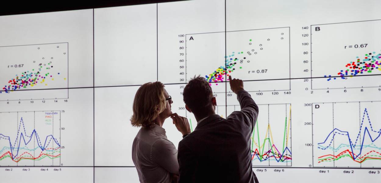
The key here is to get visual with your findings to grab the audience’s attention; anything from quizzes and maps to infographics and timelines are fair game to use in presenting your findings. It’s a great way to differentiate your data from the usual bar graphs and pie charts, which tend to concern themselves with data exploration rather than aiding a narrative. Pulled off in the correct way, good visualisation stands on its own even when taken out of context; your audience can still understand what a chart is saying because the visuals serve to tell the story.
However, be mindful of too much interaction if you’ve gone down that route. It can be distracting and take away from the focus of the information. The key is creating a sense of discovery by layering data into the visuals so the curious can delve into what you’ve presented.

Be objective in your presentation
In both visualising and presenting your data, aim to be as objective as possible and avoid bias. Even if you’re making an argument, base it on what the data says, not what you want it to say. Emphasise objectivity by labelling in a way that avoids ambiguity, ensure that graphic dimensions match data dimensions, use standardised units, and keep design elements from compromising data. Objectivity is an easy thing to accidentally flout, so make sure your credibility remains intact; even if the story is strong, the audience may pick up on inconsistencies in your visuals if you’ve gotten careless.
Balance editing and censoring
Unless you’re confident of what the data says, try to avoid being selective with it. In presenting your data, things like using discrete values over continuous, random time frames and gaps in data will only serve to have a negative effect. Similarly, it’s important to explain the data, as opposed to just dressing it up in a series of bells and whistles. If it looks good but doesn’t do a good job of explaining the data, then consider going back to the drawing board and re-editing things to get the most out of your data.
Click here for the latest news and features from SEFE Marketing & Trading or visit our homepage to find out about our latest career opportunities.
The views, opinions and positions expressed within this article are those of our third-party content providers alone and do not represent those of SEFE Marketing & Trading. The accuracy, completeness and validity of any statements made within this article are not guaranteed. SEFE Marketing & Trading accepts no liability for any errors, omissions or representations.


